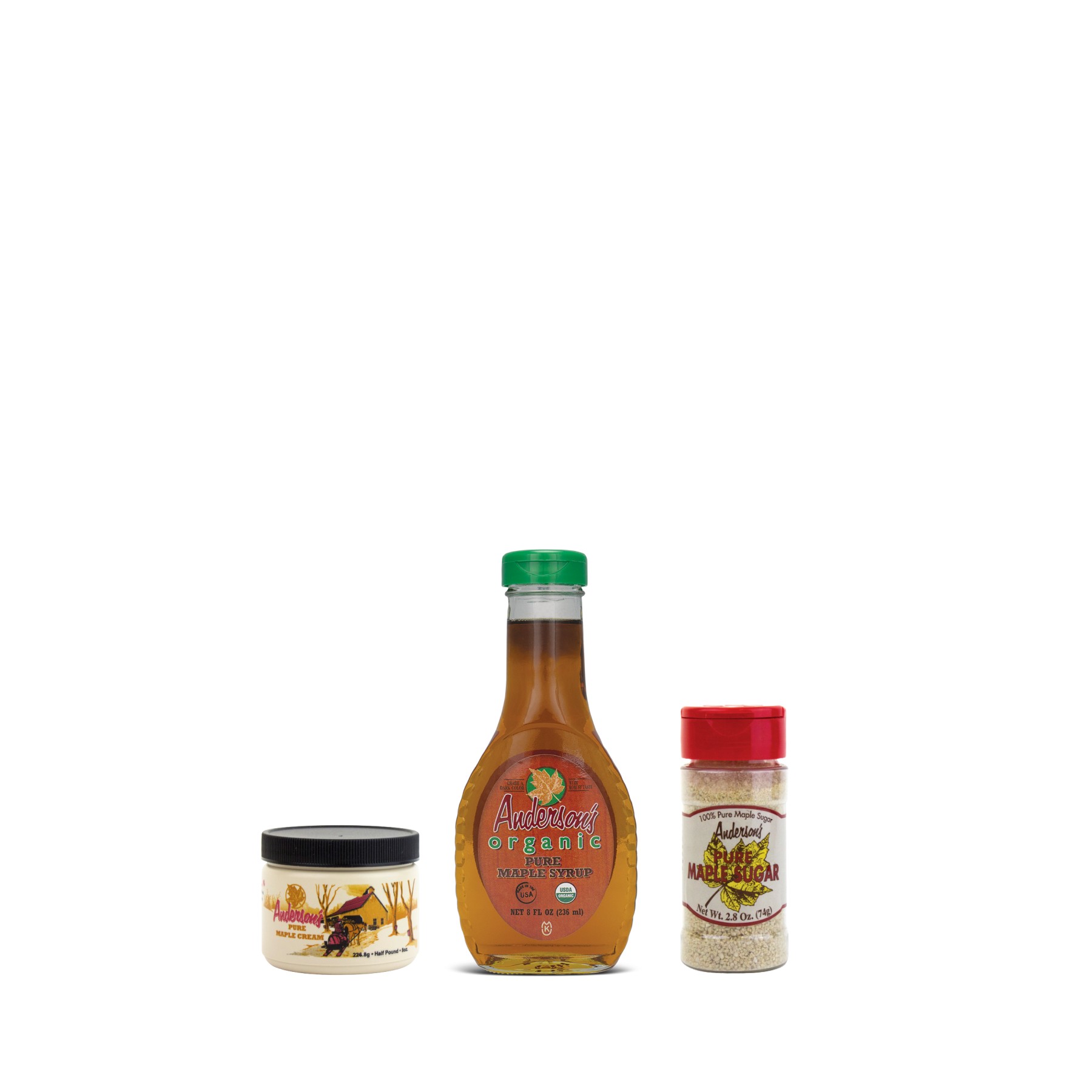
How might we rebrand Anderson’s Maple Syrup to feel relevant and aspirational, elevating its alpha, rich, and exquisite character while honoring its artisanal roots?
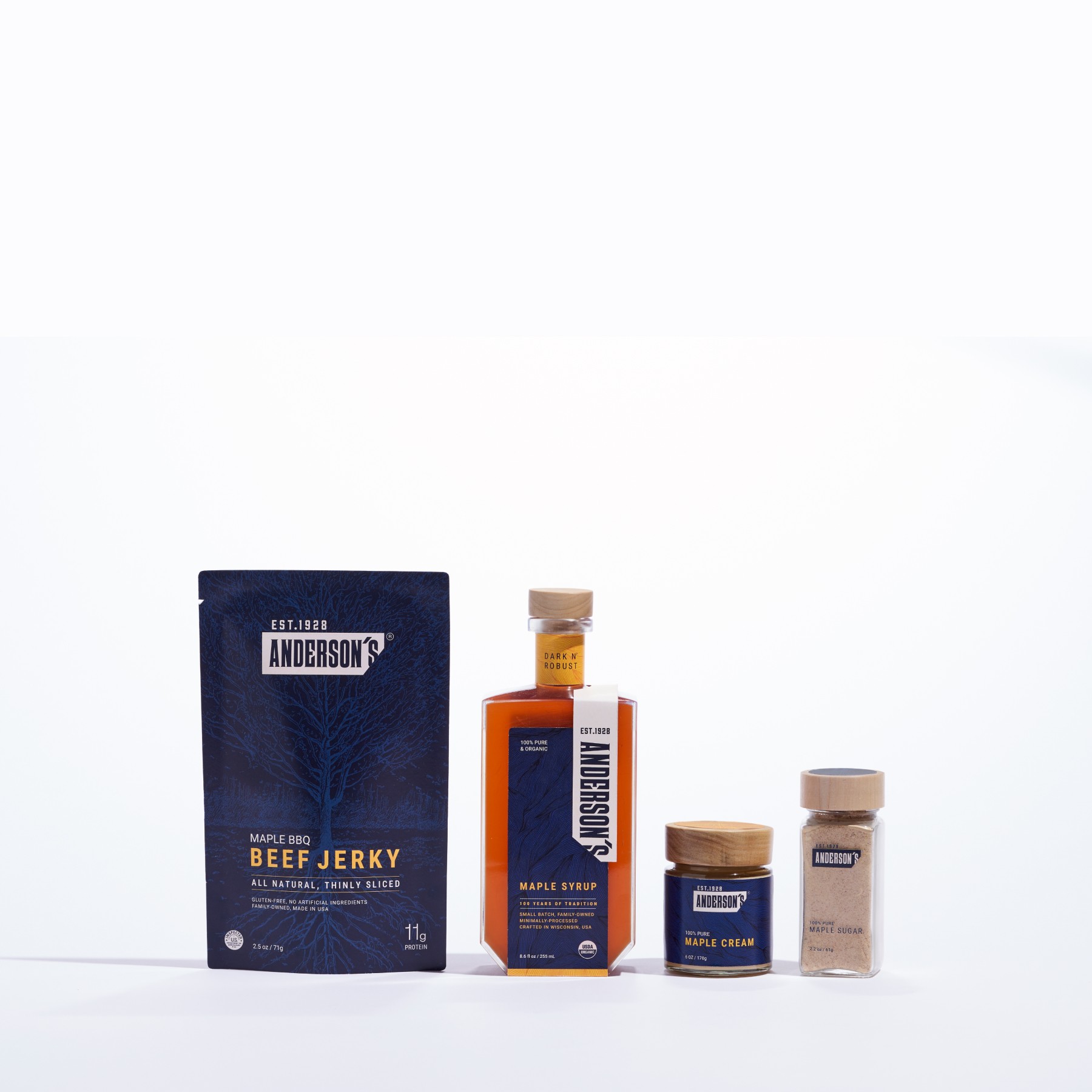
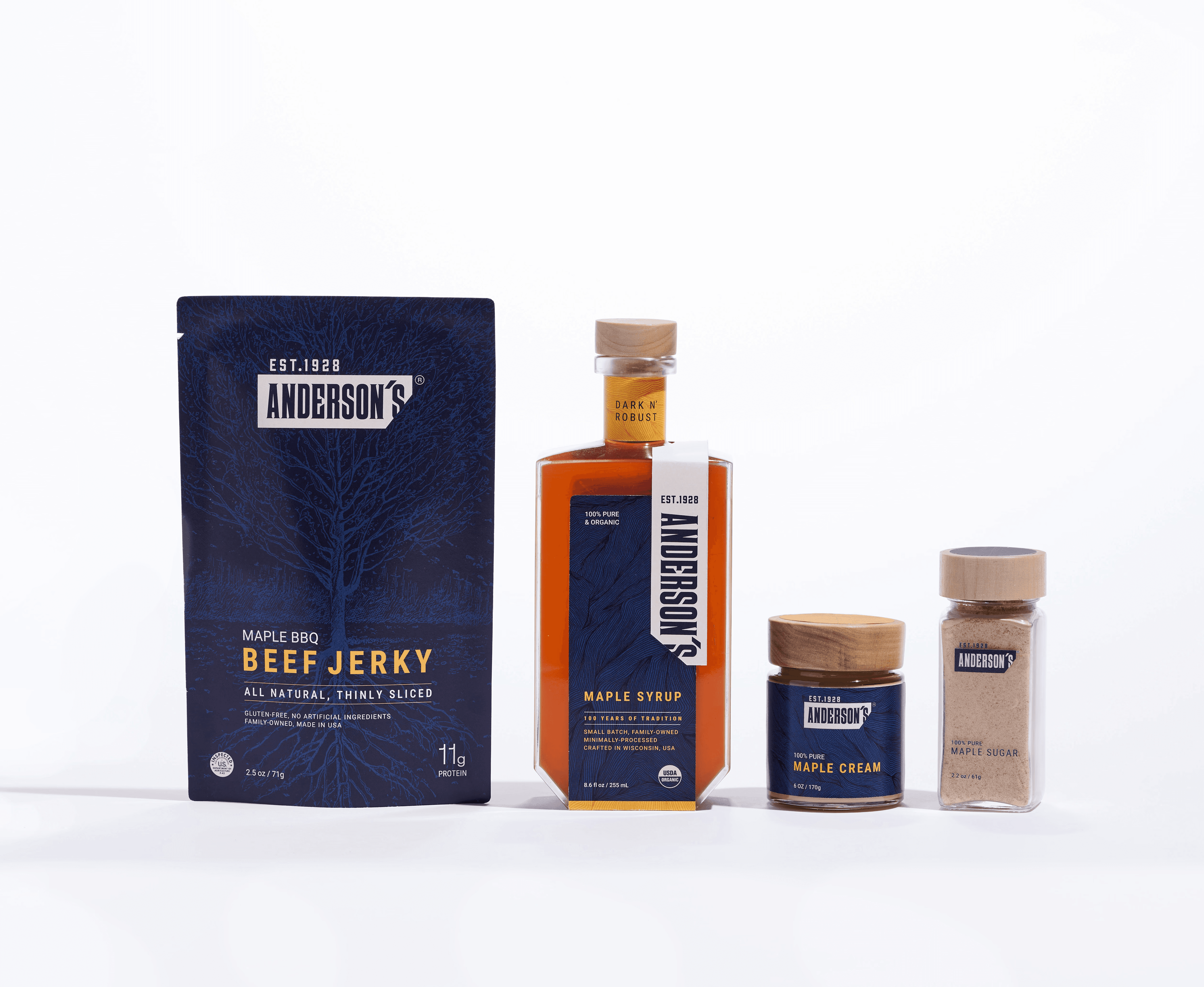
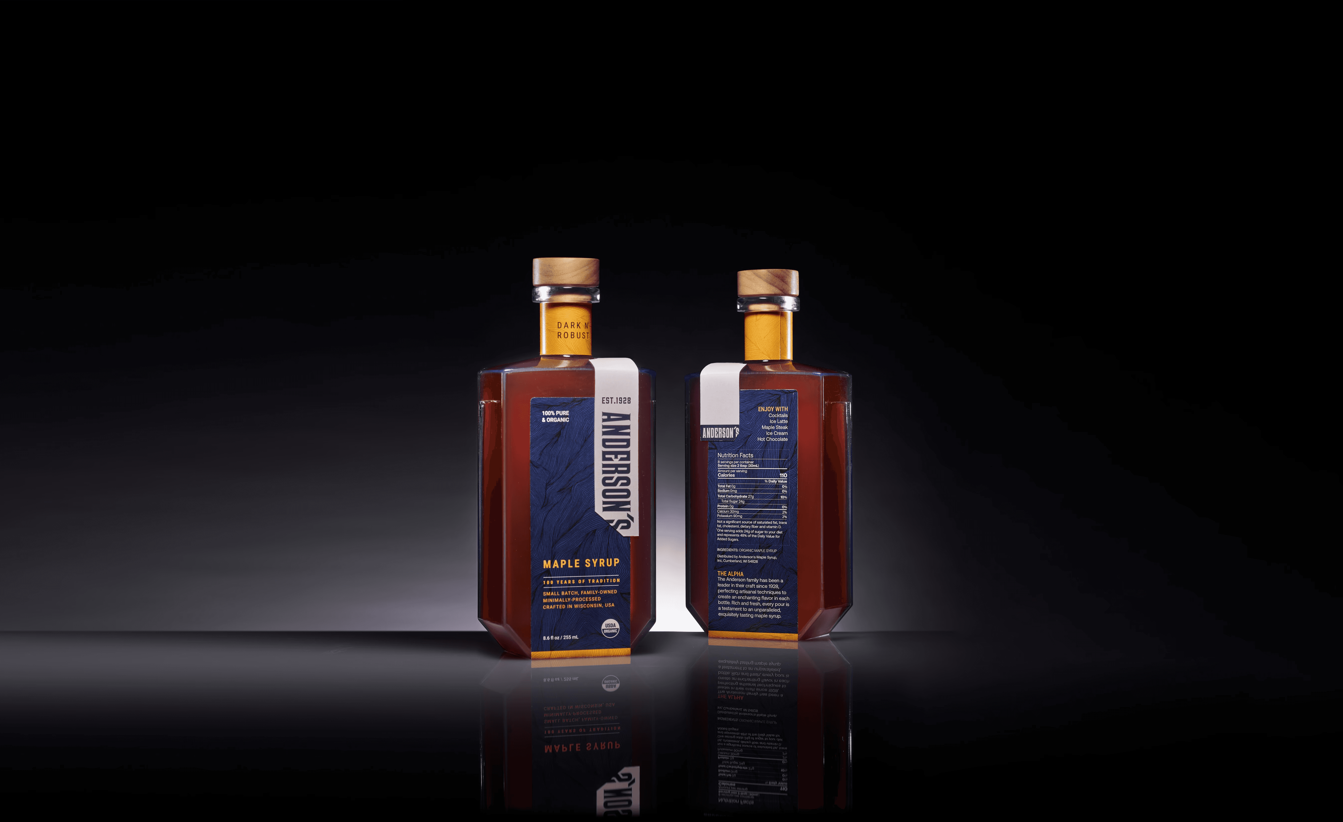
Channeling “alpha energy,” I reshaped Anderson’s packaging with whisky-inspired forms and the strong, squared shoulders of a bartender, the vertical logo nodding to a towel draped with quiet authority. This shift reframes the syrup from a morning commodity to a bar-worthy indulgence, elevating it into the world of gourmet dishes and craft cocktails.
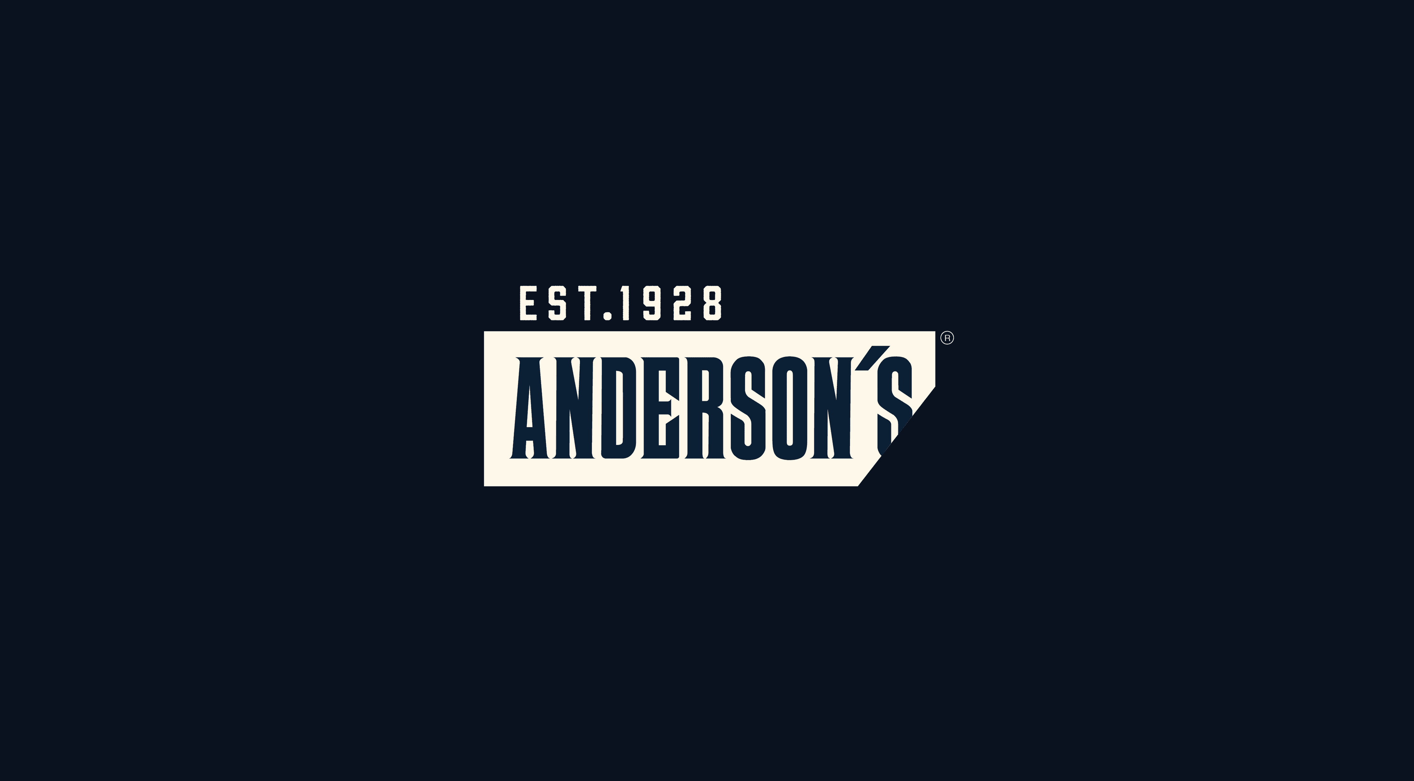

Logo Redesign
Set in WTC Banger, the logotype draws from traditional wood-type printing to preserve Anderson’s artisanal essence. A single corner cut, echoing the maple sap tap spout, breaks the rigid frame, symbolizing maple syrup breaking out of its box as we redefine its place in modern culture.
Logo Redesign
Set in WTC Banger, the logotype draws from traditional wood-type printing to preserve Anderson’s artisanal essence. A single corner cut, echoing the maple sap tap spout, breaks the rigid frame, symbolizing maple syrup breaking out of its box as we redefine its place in modern culture.


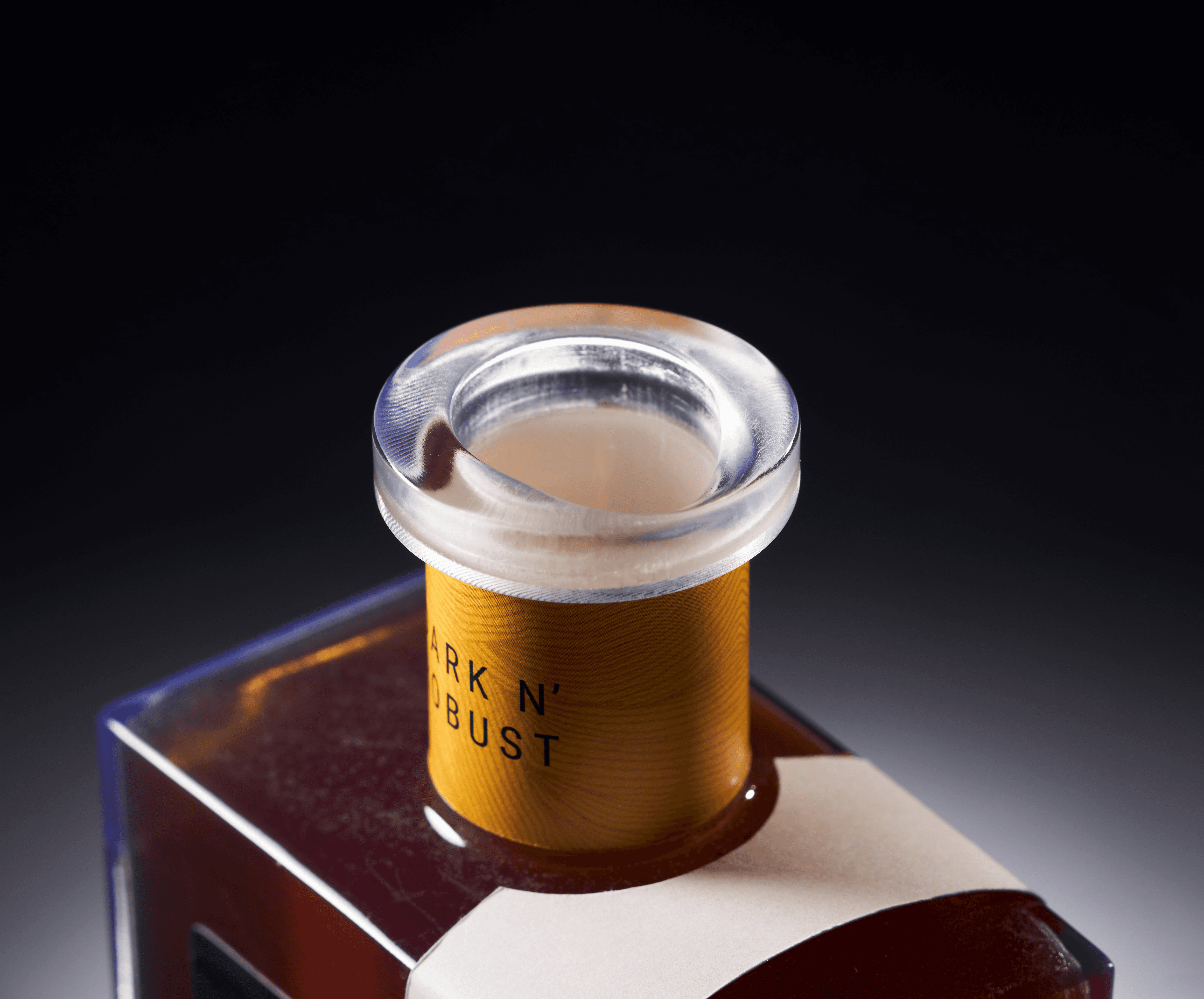
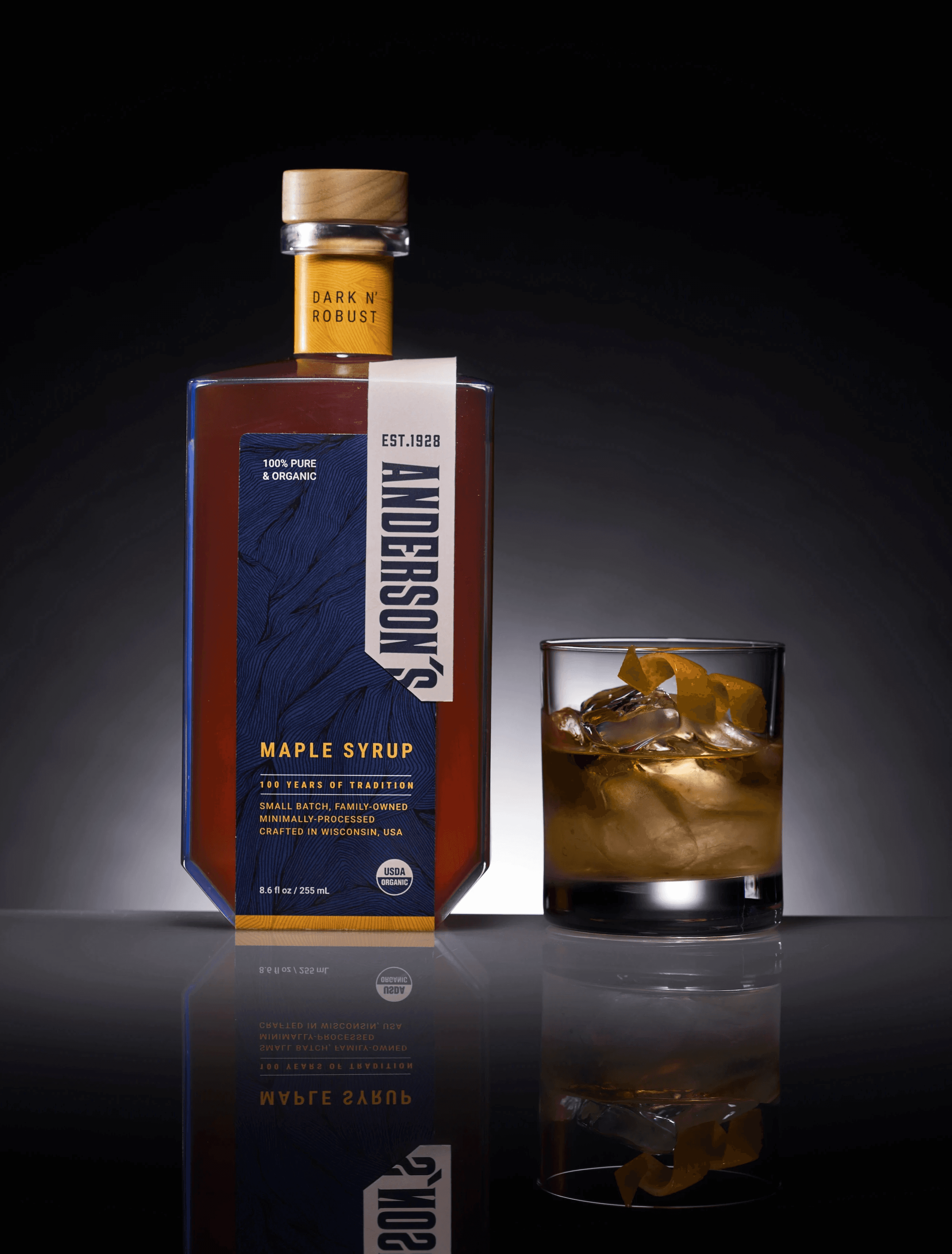
Details
The spout is draped to create a smoother, more controlled pour.
Details
The spout is draped to create a smoother, more controlled pour.