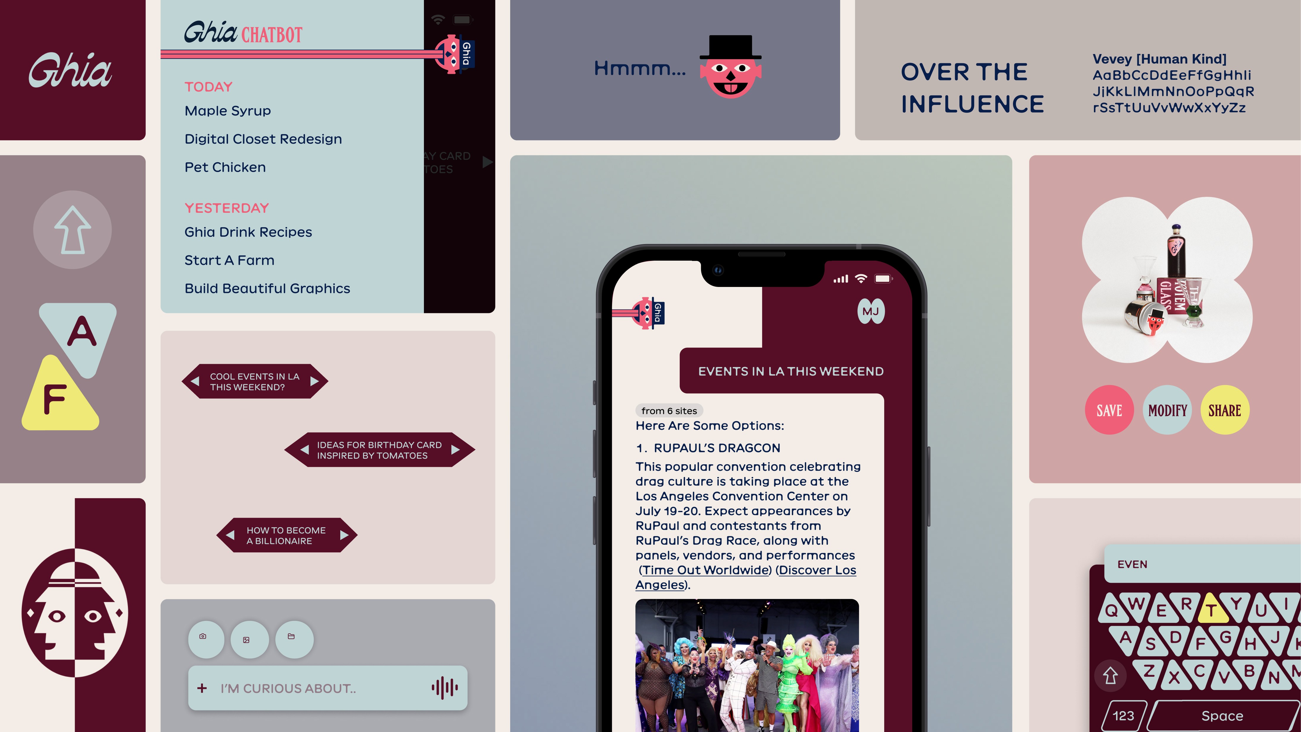
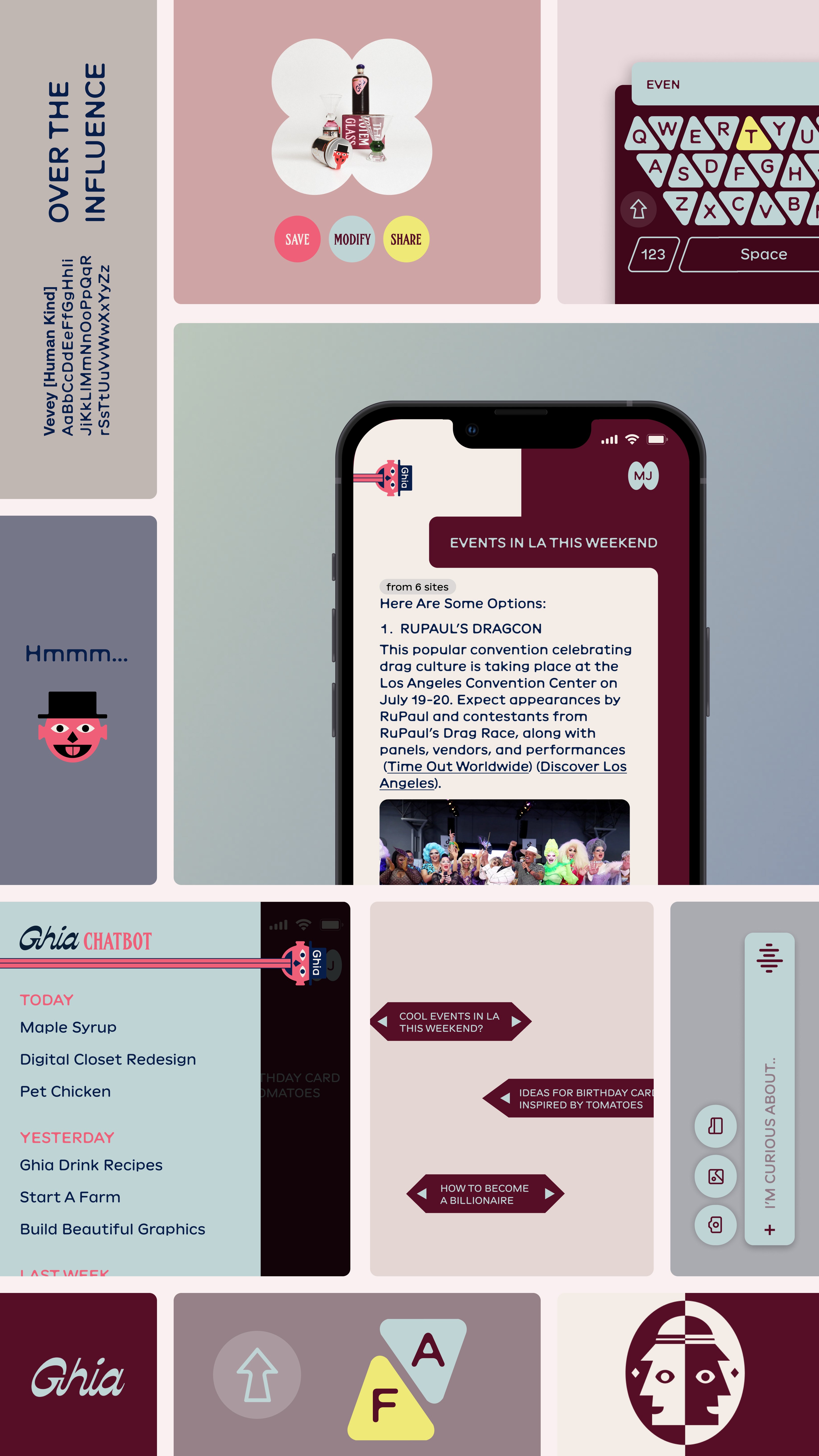
What would Ghia chatbot app would that look like, if they have one?
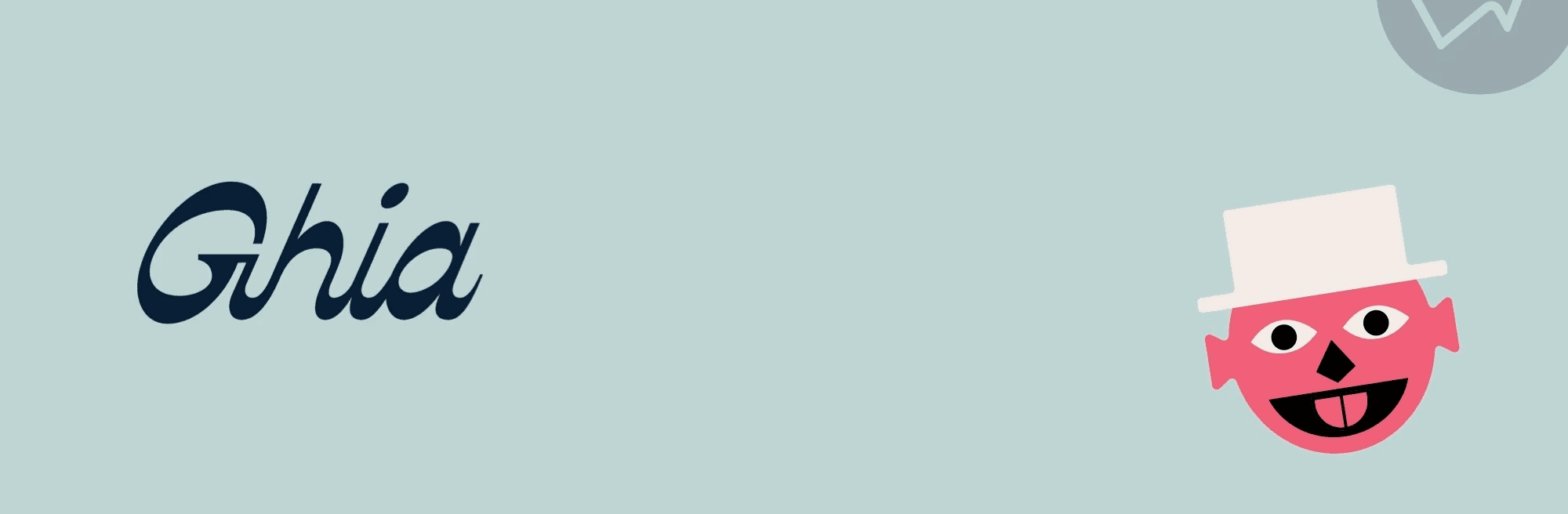
Ghia is a non-alcoholic aperitif brand with a distinctive, design-led identity that blends nostalgic Mediterranean references with contemporary, fashion-adjacent aesthetics. Visually, it positions itself as bold and elevated, more like a cult design object than a typical beverage brand.
Playing with colors, humor and illustrations that they have, I created this app concept.
Design Details
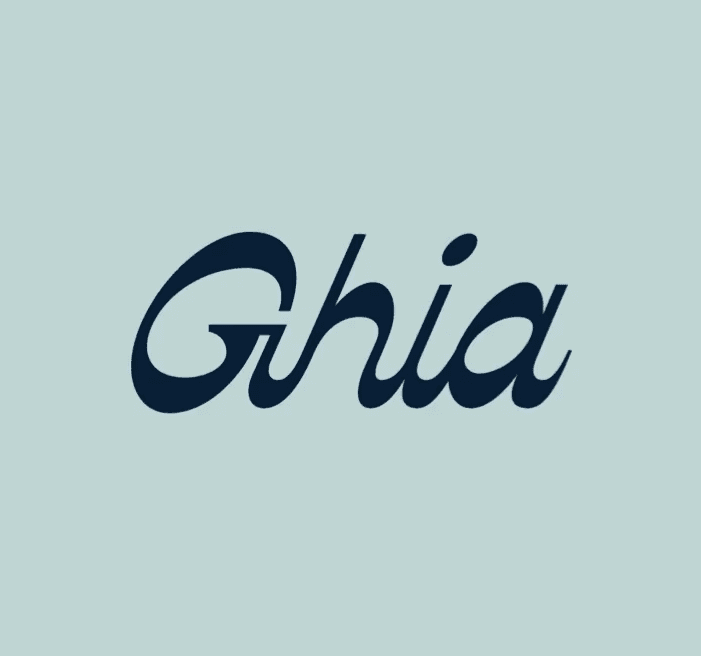
Set in WTC Banger, the logotype draws from traditional wood-type printing to preserve Anderson’s artisanal essence. A single corner cut, echoing the maple sap tap spout, breaks the rigid frame, symbolizing maple syrup breaking out of its box as we redefine its place in modern culture.
Logo Redesign
Set in WTC Banger, the logotype draws from traditional wood-type printing to preserve Anderson’s artisanal essence. A single corner cut, echoing the maple sap tap spout, breaks the rigid frame, symbolizing maple syrup breaking out of its box as we redefine its place in modern culture.
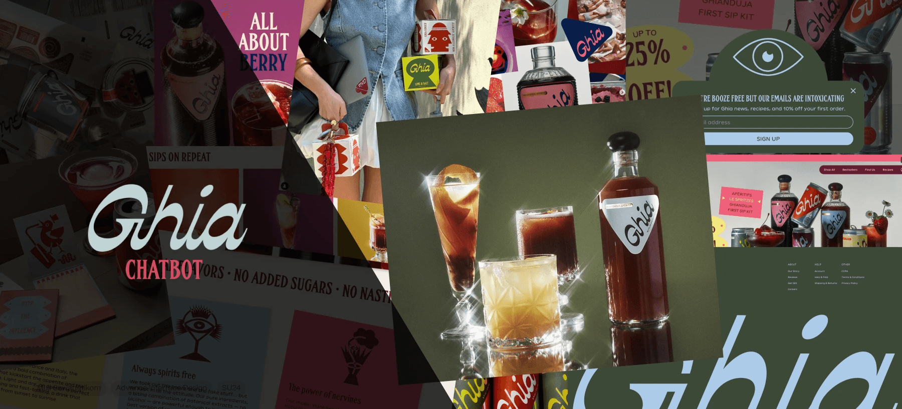
What is Ghia?
Ghia is a non alcoholic aperitif brand. This is their existing design language that I collaged together.


Design Language
Mediterranean-inspired look, evoking classic European aperitif culture and old Italian resort towns through color, typography, and photography. A balance of nostalgic and modern cues
Design Language
Mediterranean-inspired look, evoking classic European aperitif culture and old Italian resort towns through color, typography, and photography. A balance of nostalgic and modern cues
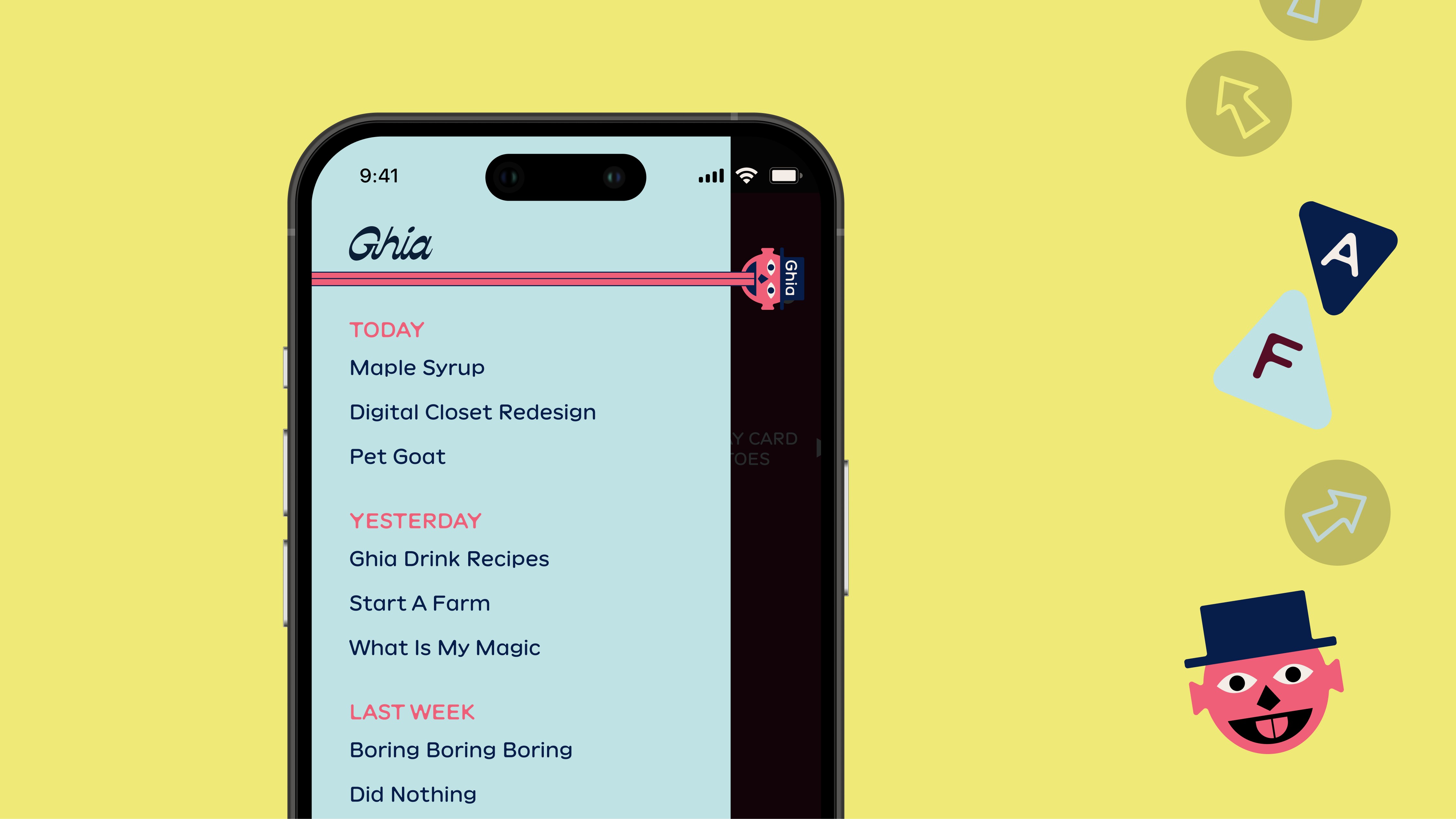
Design Details
The chat is divided into 2 sections; left side is from the bot and the right from the user. I was inspired by the two-face illustration from the brand.
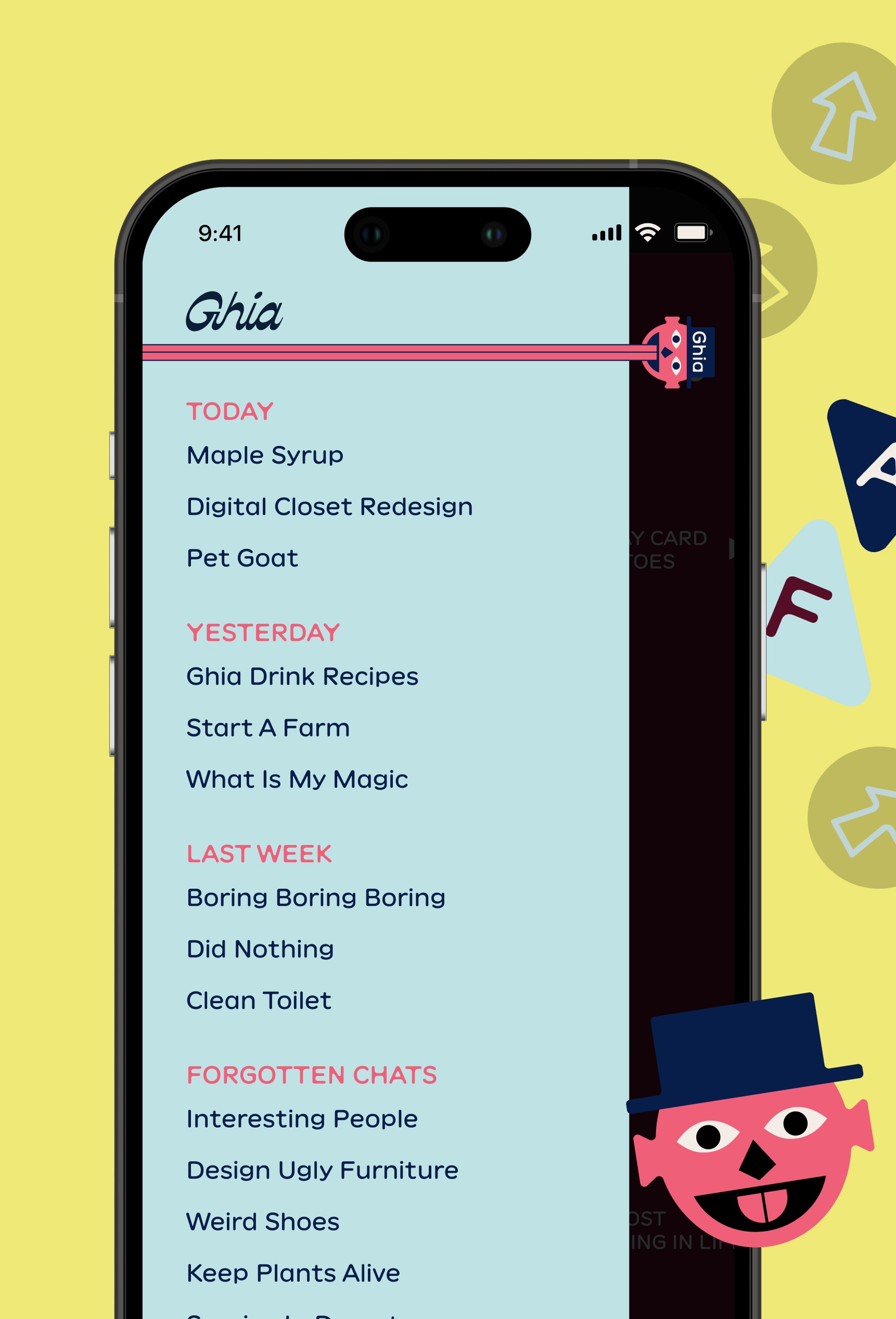
Design Details
Inspired by the tongue-figure illustration from the brand, I animated it to open and close side nav.
Design Details
Combining the use of word and rotating illustration to create a humorous loading state ~
Design Details


Information Design
Typeface used is Vevey. Image treatment shapes are very playful borrowing from the ones used on their bottles.